Unit 1J Woodbridge Road
Sleaford Lincs NG34 7EW
Tel: 01529 415050
Fax: 01529 306699
Email: mail@westgateprint.net

DESIGN
COPY
PRINT
FINISH


Prepare artwork for single colour work in black and specify colour with order. Check contrast and brighten image to compensate for dot gain when using uncoated stock.
Artwork for multi colour spot colour jobs can be tricky. Check that all colours used are converted to spot pantone and not CMYK (take particular care with images). Trapping may be an issue - if in doubt ask!
SINGLE/SPOT COLOUR
CMYK (FULL COLOUR)
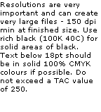
Check black line art and text are purely 100K and not a mix of CMYK. Large black areas need to be rich black, 100K 40C. RGB images must be converted to CMYK and the colour checked for suitability. Use a Pantone CMYK chart to check colour match, if the nearest CMYK equivalent is not suitable it may be necessary to produce a CMYK + spot job. Avoid TAC values above 250.
FINAL CHECKLIST
Be sure to print a hard copy of your layout before sending it through to us. You may well be surprised how different it will appear - text appears larger than on screen and minor layout and alignment problems are far more obvious. If the facility exists, print out with crop marks on the fit to page setting so that you can check bleeds. If preparing artwork for a small item such as a business card or postcard always draw a fine black key line around the edge of the page before printing - this will help check the balance of the layout - a tiny image in the middle of an A4 sheet is sometimes difficult to visualise.
If possible get someone else to proof read the hard copy - a fresh eye often spots embarrassing errors before they have been reproduced in quantity!
However experienced you are please just run through the checklist below. If you are not familiar with any of the points please click the relevant box to direct you to more in depth information.


SUITABLE FILE / FORMAT
CHECK
Check that we support the application in which you have created your document. If not, export as a PDF making sure you embed all text as curves.


PAGE SIZE
CHECK
Check that the document is the correct page size. Many Microsoft programs have a habit of defaulting back to American paper sizes.


FONTS
CHECK
Only use True Type or Open Fonts, no printer fonts. If the font is unusual please include with your file or embed. Do not use application created emboldened or italic versions of fonts.


IMAGES
CHECK
Check resolutions and quality of images: line art 600 - 1200dpi depending upon intricacy, greyscale 300dpi, CMYK 350dpi. Also check for cross screen.


LINKS & OLE OBJECTS
CHECK
Make sure that all objects are either embedded or that links are supplied. Do not use OLE objects, they do not always open when exported to a different PC.


OUTLINES AND FILLS
CHECK
Avoid hairlines, they do not always print as expected. Stick to .25pt minimum outline/line/stroke. Check all outlines and fills for consistent weight and colour.


BLEEDS
CHECK
A 3mm bleed is required. This causes more problems than anything else - if you are not absolutely sure what this means PLEASE check!


The standard size for a Business Card is 85mm x 55mm. Max size is 90mm x 60mm. Avoid borders with small margins - minute move-ment during guillotining will be very obvious to the eye - text should be at least 3.5mm from edge of card.

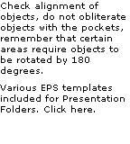
Check measurements of margins and gutters, make sure items back up, be especially careful if using a cut out or perforated area.
An EPS template is included for a 6 panel 1/3 A4 folded leaflet adjusted for neat folding. Click Here.

BOOKLETS & MULTI
PAGE DOCUMENTS
PAGE DOCUMENTS
Save as one single document with multiple pages - do not impose. Check page numbers. Other than the centre pages do not allow objects to cross pages. Leave enough margin, bear creep in mind when producing thicker saddle stitched booklets.
CHECK
CHECK
CHECK
CHECK
CHECK